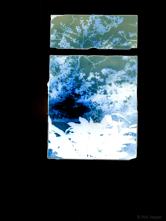
Playing with negative space and "negative" color hues. Gimmicky, you say? Perhaps.
I rather like it, though my blog's default grey frame doesn't work all that well in this case. Best viewed on white background (you can switch above, to the right).

Playing with negative space and "negative" color hues. Gimmicky, you say? Perhaps.
I rather like it, though my blog's default grey frame doesn't work all that well in this case. Best viewed on white background (you can switch above, to the right).
ooh, neat! it feels almost prehistoric somehow…
haunting! Thank you.