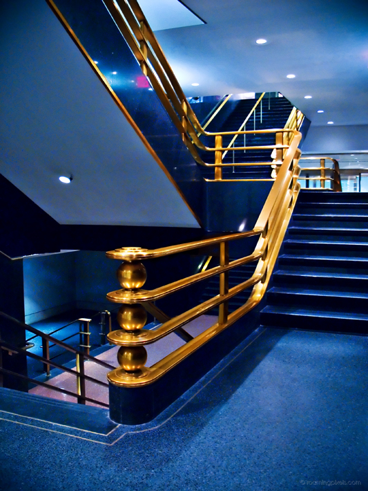
Another take of the same architectural detail at Rockefeller Center (see previous entry).
I frequently wonder about vertical vs. horizontal formats, and I notice my own preference for verticals. Unfortunately, they are less convenient for online viewing. Which do you prefer?
i think i liked the brownish color in the other one better but this one’s cool too. nice composition and effect.